
Working with AWS
Working as a contractor with Amazon Web Services (AWS), I’ve had the opportunity to tackle various design projects, from creating email templates and social media ads to laying out detailed sell-sheets and whitepapers. But one project that stood out was the redesign of the AWS Canada homepage—a task that came with its own set of unique challenges and a fair share of creative opportunities.
When I was handed the assignment to redesign the AWS Canada homepage, there was little instruction beyond making it work within their existing content management system. So, to get started, I did what any designer worth their salt would do: I performed a full sweep of the current AWS site, auditing the available features and UI elements. The goal was to understand the playing field, to know what was possible, and to push those boundaries while staying within the framework.
Given the constraints of working with AWS—a place where visibility into projects, schedules, and timelines is often as elusive as the cloud itself—I relied heavily on what I could see and access. There were no internal microsites for testing, no access to sandbox environments—just the live site and my own ingenuity.
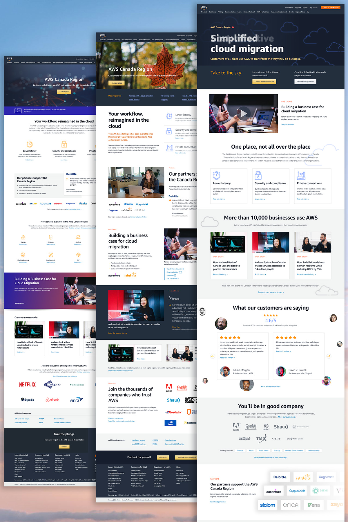
With that in mind, I presented three distinct homepage mock-ups, each tailored to different levels of ambition and risk tolerance.
Mock-up 1: The “Work-with-what-you-have” Approach
The first mock-up was a conservative approach, sticking close to what AWS already had in place. It was a “show your work” type of effort, designed to prove that I’d done my homework.
- Design Notes:
- A familiar layout, with a header image and callout feature highlighting their latest webinar, playing into the old-fashioned AWS marketing mindset of keeping key elements “above the fold” like it’s 1995.
- Use of AWS line art icons and graphics to maintain visual consistency.
- A customer quote callout to emphasize ease of use—again, nothing groundbreaking, but a necessary inclusion.
- A slight push toward modernity with a blue-red-orange gradient background in one section, meant to draw attention to a new webinar.
- Three customer success stories—standard fare, as exciting as a corporate pizza party.
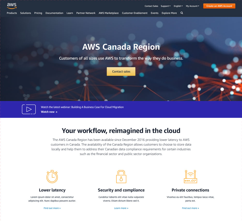
This mock-up was flat, safe, and a bit boring, but it was crucial to establish that I understood the existing AWS aesthetic and was capable of working within it.
Mock-up 2: The “Anti-design” Approach
For the second mock-up, I decided to be bolder. It wasn’t truly anti-design, but it was definitely a departure from the norm, with a focus on shaking things up without breaking the mold.
- Design Notes:
- More whitespace and larger headlines further down the page, moving away from the cramped, content-heavy layouts of the past.
- A darker background for the latest webinar—because heaven forbid we stray from AWS’s typically light and bright palette.
- Bigger, bolder typography, but with less overall content. A nod to the idea that sometimes, less is more—especially when you’re AWS, with the world at your fingertips.
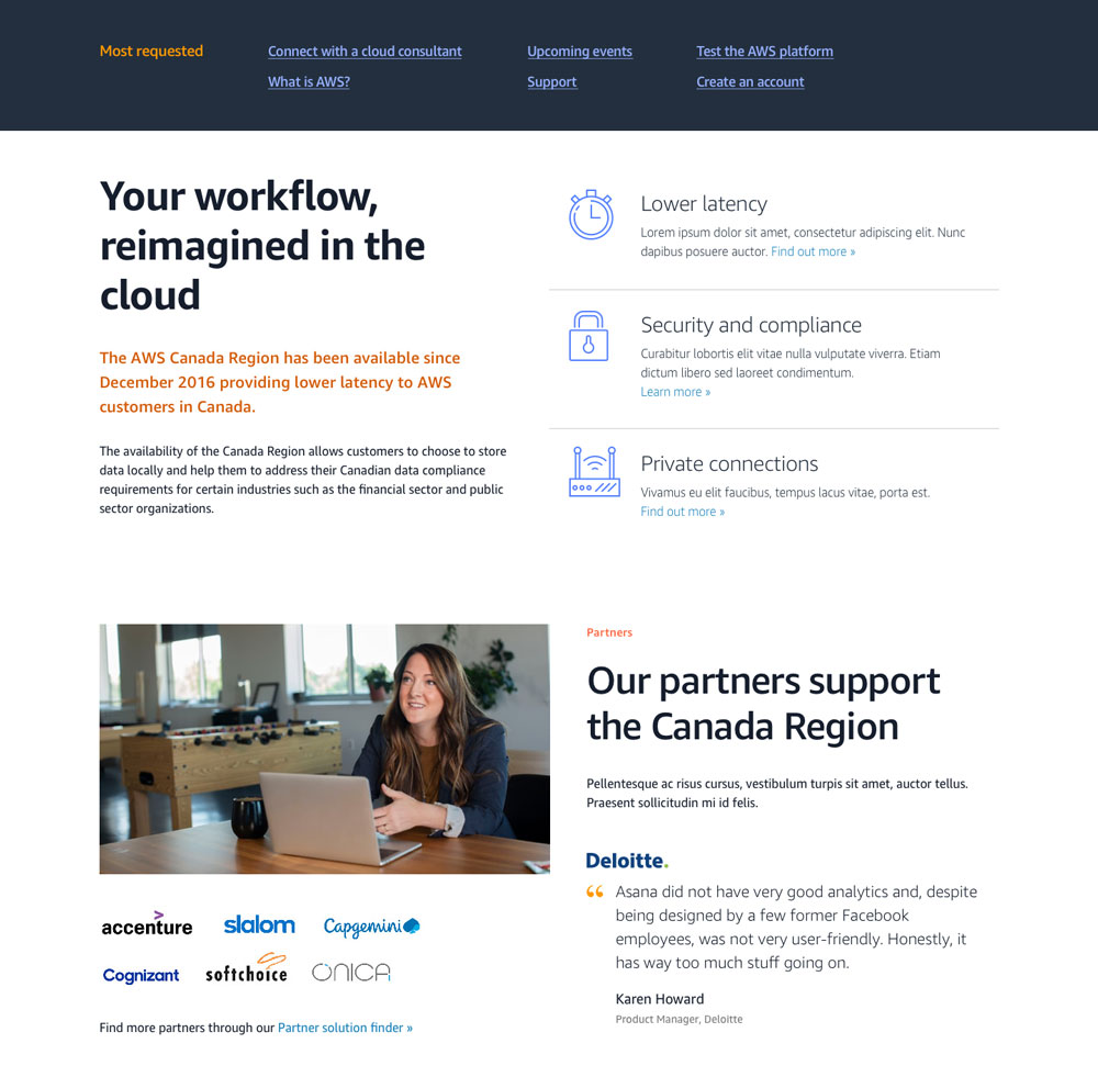
This mock-up challenged the status quo, offering a glimpse of what AWS could look like if they were willing to embrace a bit of daring design.
Mock-up 3: The “Modern” Approach
The third mock-up was my favorite—a modern, cloud-inspired design that fully leaned into AWS’s identity.
- Design Notes:
- A dark header area with subtly animated AWS line art clouds, paired with a text overlay cycling through buzzwords like “Simplified,” “Cost-effective,” and “Rapid,” all leading into “cloud migration.”
- A white page body background featuring 50% opacity blue line art clouds, fading in to create a sense of depth and movement.
- Larger, bolder statements like “Take to the sky” and “You’ll be in good company,” aimed at making a big impact with fewer words.
- A customer reviews section with avatar photos popping in and out like clouds, creating a dynamic, engaging visual experience.
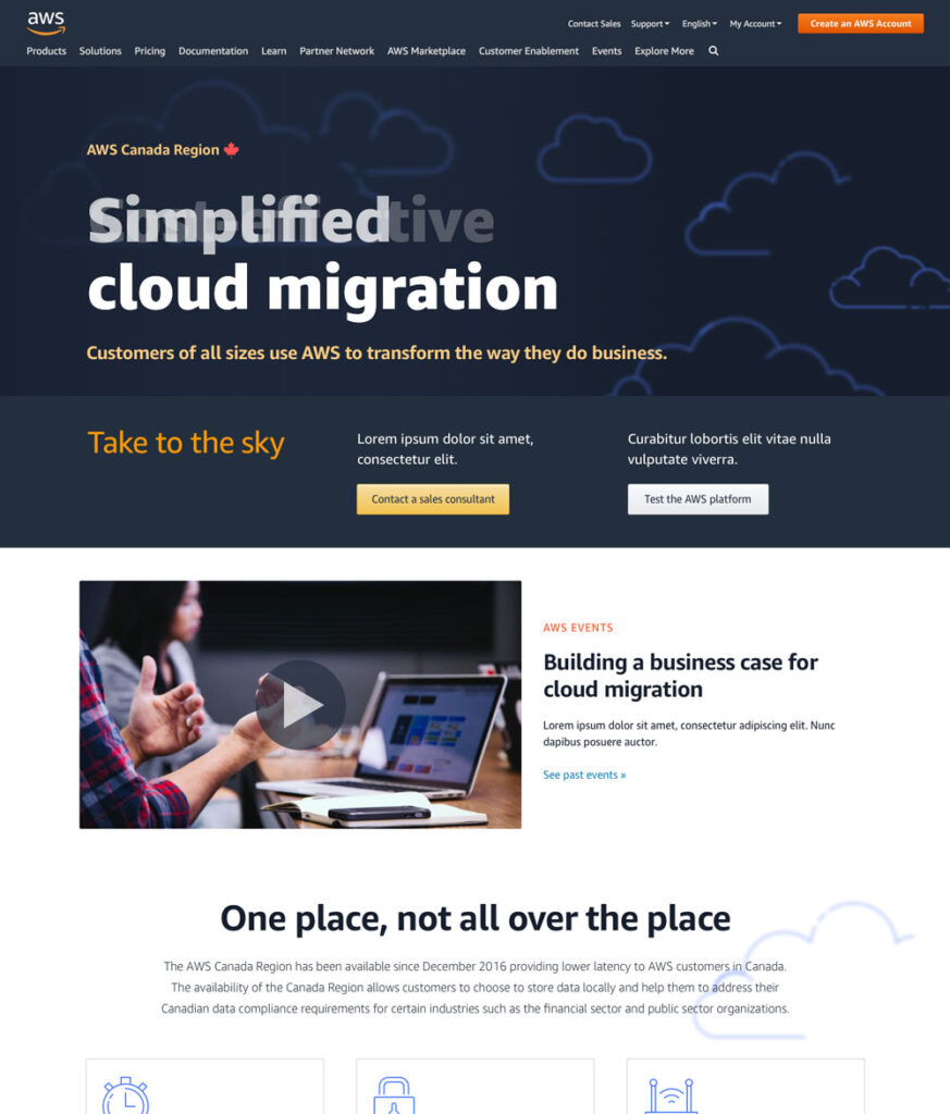
This mock-up represented what AWS could be—a leader not just in technology, but in design. It was all entirely feasible within the existing AWS framework. All that was needed was someone with the vision and courage to pull the trigger.
The Reality of Working with AWS
Working with AWS as a contractor is an exercise in patience and resilience. Their full-time employees often seem insulated from the realities of tight timelines and the rush mentality that pervades Amazon culture. The lack of access to internal tools and the opacity around project timelines can make the work feel like a shot in the dark.
But despite these challenges, the redesign of the AWS Canada homepage was an opportunity to push the envelope, to question the status quo, and to present designs that not only met the brief but dared to suggest what AWS could achieve with a bit more creativity and boldness.
In the end, whether they choose to stick with the safe and familiar or venture into something new and exciting, the work speaks for itself. Sometimes, all it takes is a nudge in the right direction to remind even the biggest players that the sky—like the cloud—is the limit.