Canaccord Genuity
I recently had the opportunity to design the landing page for the Canaccord Genuity Growth Conference, creating a visually engaging and seamless experience for attendees. The layout is intentionally simple, allowing the content to shine while incorporating subtle animations as users scroll down the page.
One of the main design elements of the Canaccord Genuity brand is their distinctive 22-degree angled slash, a wide forward slash ( / ) that symbolizes forward progress and upward motion. This element is thoughtfully integrated into the design, with the angled slashes animating in from the sides as you navigate through the page. This dynamic movement captures the essence of the brand, suggesting momentum and growth.
Complementing the angled slashes, we utilized dark night photography featuring light streaks from moving vehicles. These images not only add visual interest but also highlight small design elements that easily catch the eye. The interplay of light streaks and animated slashes creates a sophisticated and modern aesthetic, reinforcing the theme of progress and innovation.
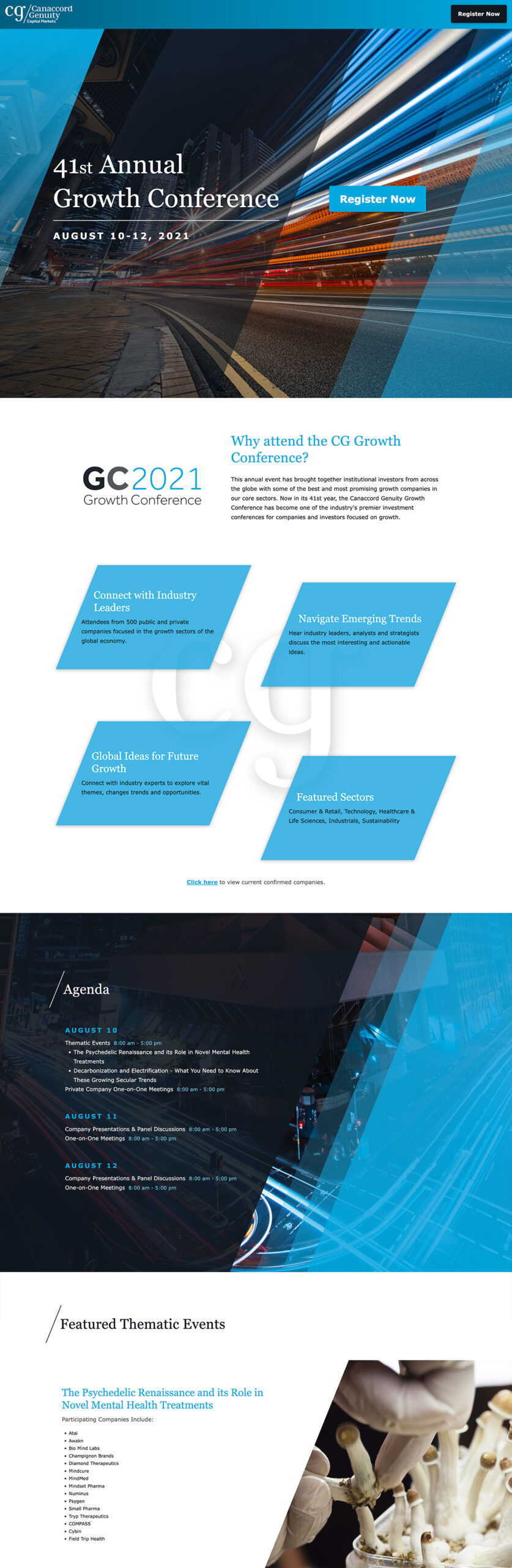
As users explore the landing page, the subtle animations and strategic design elements work together to provide an engaging and immersive experience. The careful attention to detail ensures that the page not only looks appealing but also effectively communicates the forward-thinking ethos of the Canaccord Genuity Growth Conference.
Overall, the landing page design for the Canaccord Genuity Growth Conference is a testament to how small, thoughtfully integrated design elements can make a significant impact, capturing the attention and imagination of visitors while conveying a sense of progress and innovation.