
GB Wealth brand identity
When GB Wealth approached me to help shape their brand identity, it was clear from the outset that they were navigating uncharted territory. This was their first time building a brand and website from scratch, and they needed a guiding hand to help them establish a cohesive and professional image. My role quickly evolved into leading the creation of a comprehensive brand guidelines document that would serve as the foundation for their future development efforts, including their website.
The process began with their logo, a black and white design featuring a shield with two shepherd’s staffs stylized to resemble a lowercase “g” and “b.” While the logo provided a solid starting point, the real challenge lay in refining their initial color scheme. GB Wealth had initially chosen green as their primary color (hex #00C282), complemented by secondary colors like dark purple, soft yellow, soft sky blue, off-white, and off-black. However, each time I incorporated their chosen green into designs, feedback indicated that it was “too green,” leading to numerous iterations and refinements. It was a classic case of working with a client to balance their vision with practical design considerations.
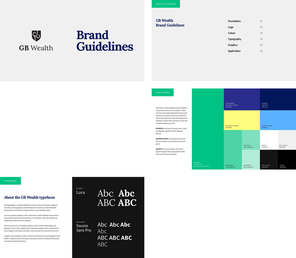
Throughout the process, I utilized my preferred graphic tool, Sketch, to develop a detailed brand guidelines document. This document became a crucial resource for GB Wealth, outlining everything from logo usage to typography, color schemes, and graphic elements. Key sections of the document included:
- Table of Contents: A roadmap for navigating the document.
- Using this Manual: Guidelines for how to apply the brand elements effectively.
- Logo Usage: Clear instructions on how to use the GB Wealth logo, including the shield as a graphical element.
- Our Colours: A detailed explanation of the brand’s color palette, including how to balance the primary and secondary colors.
- Typography: Guidelines for using the serif font Lora for headings and Source Sans Pro for body text and subheadings.
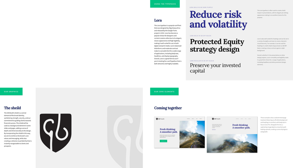
- Using the Typefaces: Best practices for font usage, ensuring consistency and readability across all materials.
- Our Graphics: An outline of the preferred photography style, featuring natural paths, to evoke a sense of guidance and growth.
- The Shield: Instructions on how to integrate the logo shield into design layouts effectively.
- Our Core Elements: A comprehensive guide to combining photography, logo, and typography in web layouts.
This document wasn’t just about setting rules; it was about guiding GB Wealth toward making informed design decisions that aligned with best practices for accessibility, user experience, and user interface. I worked closely with the team, often countering their initial proposals with insights into potential pitfalls, such as the risk of poor user experience or accessibility issues. My goal was always to strike a balance between their vision and practical design considerations, ensuring that the brand would be both visually appealing and functional.
The result was a brand guidelines document that not only reflected GB Wealth’s aspirations but also set them on the right path for their future growth. This foundational work paved the way for the subsequent development of their website, ensuring that every element was consistent, professional, and user-friendly.
Working with GB Wealth was a productive experience, demonstrating the importance of collaboration, patience, and a guiding hand in the world of brand development. As they continue to establish their presence in the mutual fund investing industry, this brand guidelines document will serve as a cornerstone for their ongoing success.