
Allstate blog
In the realm of web development, flexibility and problem-solving are key, especially when tasked with converting static designs into functional templates. Recently, I had the opportunity to work on a project for Allstate Insurance, where my role was to transform a simple static design into a fully functional HTML, CSS, and JavaScript template for their WordPress site.
One unique challenge of this project was the absence of a mobile design. Without predefined mobile guidelines, I had to leverage best practices and my expertise to ensure the site was responsive and user-friendly across all devices. By incorporating fluid grids, flexible images, and media queries, I crafted a template that seamlessly adapts to various screen sizes, providing a smooth user experience whether on a desktop or a mobile device.
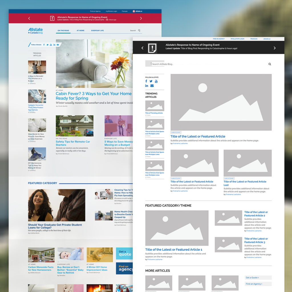
While the core of the site was built to be robust and adaptable, the ongoing maintenance and adjustments fall into the hands of the client. Currently, the live site shows some inconsistencies, such as font styles and margins that appear off due to user errors or oversight. It’s a reminder that the upkeep of a site is as crucial as its initial development.
The Allstate Insurance project underscores the importance of creating a strong foundational template and the necessity of client involvement in maintaining the integrity of the design. Despite the current visual hiccups, the site stands as a testament to effective responsive design and the collaborative effort required to keep a digital presence polished and professional.
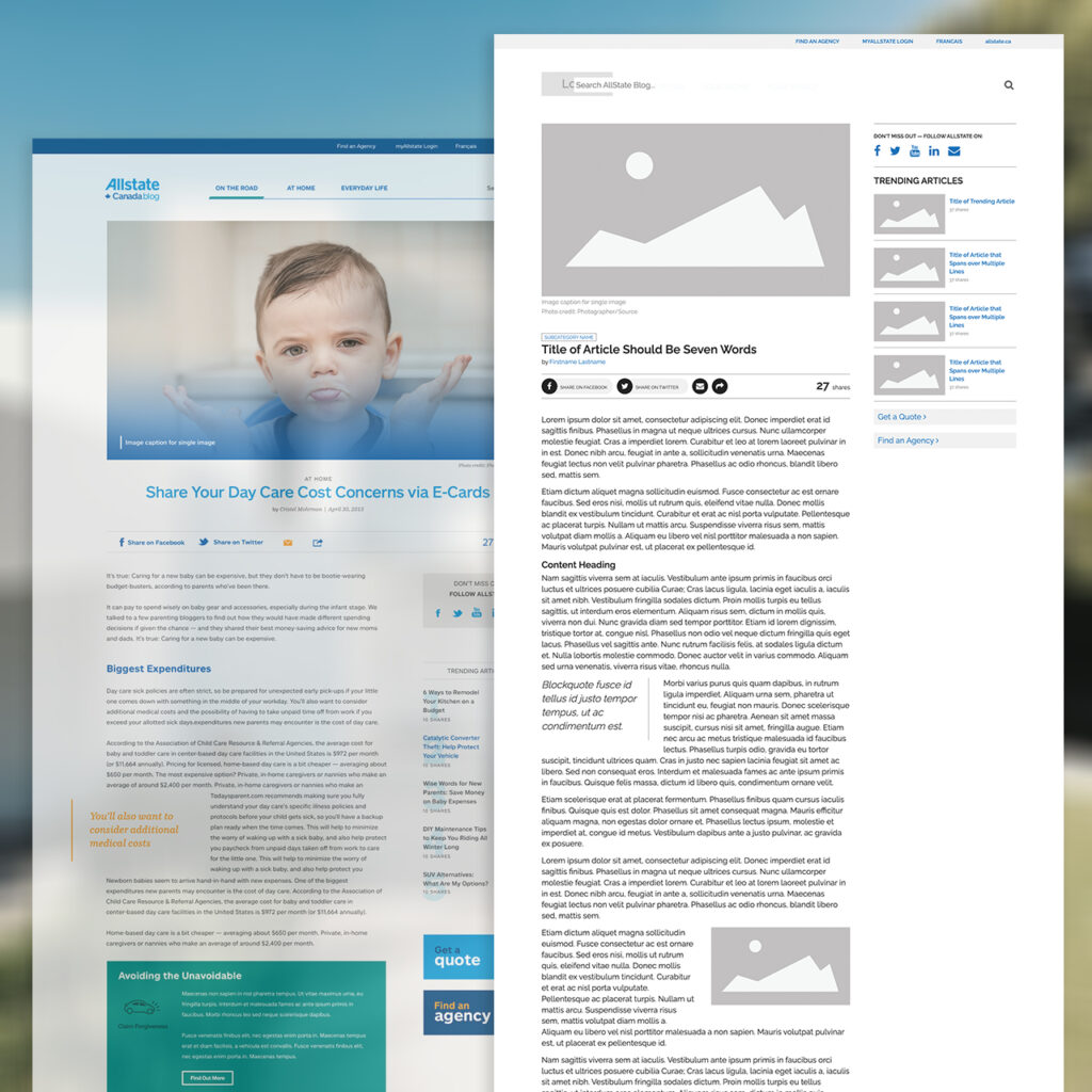
You can view the site here.