

Cancer Care Ontario
As a front-end developer at Cancer Care Ontario (CCO), I was fortunate to be part of a team dedicated to implementing modern web development practices aimed at spreading awareness, prevention, and care across Ontario. My role involved a range of tasks, from building out iconography and coding CSS stylesheets to conducting QA testing and developing comprehensive website brand guidelines.
One of the key aspects of this project was ensuring that all websites under the CCO umbrella, including the main CCO site, the corporate CCO Health site, and other associated brands like the Ontario Renal Network and the Ontario Palliative Care Network, were not only visually cohesive but also fully compliant with the Accessibility for Ontarians with Disabilities Act (AODA). AODA compliance was a critical focus throughout the design and development process, as it ensures that the websites are accessible to all users, including those with disabilities.
The work I did on these sites extended beyond just creating visually appealing and responsive designs. It was about making sure that every element—from iconography to interactive components—was accessible and usable for everyone. This commitment to accessibility was especially important given the target audience of these sites, which includes patients, healthcare providers, and the general public.
In addition to my front-end development work, I also took part in conducting usability tests with healthcare workers. These tests were crucial in understanding how real users would interact with the websites, allowing us to make informed decisions about design and functionality. The insights gained from these sessions helped shape the final product, ensuring that it met the needs of its users in a practical and meaningful way.
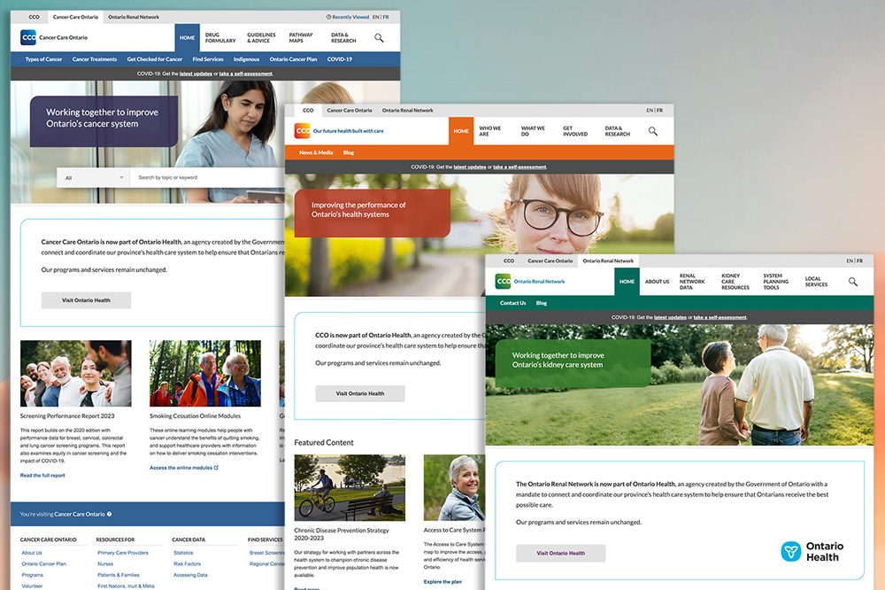
Each of the sites under the CCO brand had its own unique color scheme and style preferences, which required careful adaptation of the core templates. Despite these differences, we maintained a consistent and accessible user experience across all platforms.
My time at Cancer Care Ontario was a deeply rewarding experience, allowing me to contribute to projects that have a direct impact on healthcare awareness and delivery in Ontario. By embracing modern development practices and prioritizing accessibility, we were able to create websites that are not only informative but also inclusive and user-friendly.